
The Colours of Childhood Should be Beautiful
The history of the Bauhaus, Crayola and the primary colour childhood, and why we're leaving it behind

“Bright colour is a vital aspect of beauty” writes Hugh of Saint Victor in Umberto Eco’s Art and Beauty in the Middle Ages
Yet in the world of little children, there seems to be an abundance of bright colour, and a paucity of beauty. What can reconcile such a contradiction but the realisation that bright colour alone does not create beauty. In fact, the prioritisation of bright colour in aspects of design and aesthetics produces ugliness, because each bright colour clashes with every other when they are placed adjacent to each other in disharmonious ways.
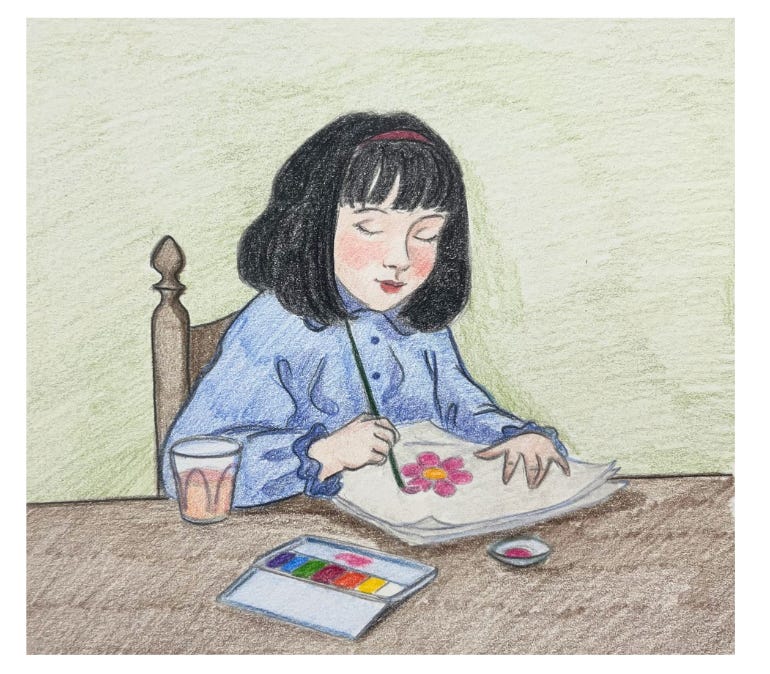
If I were to ask you what colour childhood is, you would answer not with a shade, but with a sound: loud. But the world of childhood did not always look this way. Nurseries, toys, children’s books and clothes were once created in natural, mature and beautiful colour palettes. This aesthetic of the modern childhood in the high contrast, single toned, bright primary colours, was an invention of a movement called the the Bauhaus in 19th century Germany. Today, the bright, striking primary colours of children’s toys, books and clothes are seen as the default palettes that define childhood.
However, this striking, loud, “Crayola” colour palette is doing more harm than good. It is not helping children to develop into thinking, feeling people who will have a sense for beauty and a love for the world, as colour, when deployed beautifully, ought to do.

This essay is about the history of how this happened, the consequences of this colour palette on the mind and spirit of a child, and why and how the trends are slowly shifting toward in the future.
Let us begin here. Take a moment to look at these two representations of the story of Snow White.
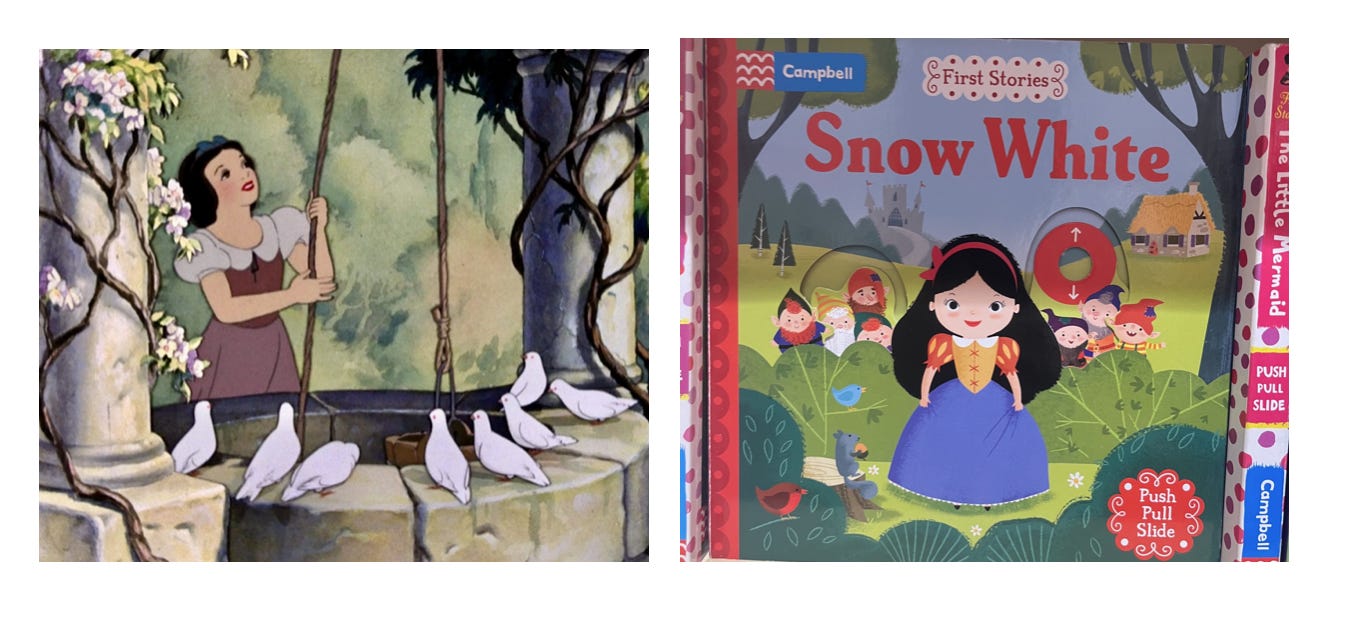
One was done by Walt Disney Studios in 1939 and the other made by a modern artist. The Disney version has a much more muted colour palette whereas the modern one has one that is full of primary and secondary colours, high contrast and with zero variance in tonality or hue.
The Disney version is not only objectively far more beautiful, graceful and elegant, but it is also far better for a child’s nervous system and attention span. The child’s attention is not pulled to a hundred different details with competing bright colours, and colour is used to inform shape, shadow and gesture rather than simply to grab attention. This means that the child actually has the mental space to attend to the story itself, the shape of the objects in the scene and to connect with the composition and the art itself.
The Disney version was made at a time when children’s animation was not about maximising attention spans but rather about telling good and beautiful stories. They did not feel desperate for attention through gimmicks like bright contrasting colours, because they knew the story was powerful enough to leave an impression for a lifetime.
The modern version competes for attention through visual gimmicks because there is no substance. It is an optimised commercial product rather than a work of art. By distracting children rather than offering them something of value, they are both deprived of real art, and mentally and visually exhausted from looking at what modern art offers.
It is interesting that as the world becomes more grey in every respect, from fashion to buildings to logos, the artefacts and objects of childhood become more colourful than ever. Foam mats are sold in bright blues, yellows, greens and red. Children’s toys come in loud primary colours. New parents often lament at the gaudiness of the objects of childhood when they fill a room and make it look cluttered and ugly, as if the ugly, overstimulating environment is a necessary for their child’s well being. Even children’s artwork, in books, films and tv shows, features a very limited palette of primary and secondary colours that all clash against each other, clamouring for attention.
In another essay I’ve talked about modern toys versus vintage ones and how they impact a child’s brain differently.
“Look at me!” everything yells to your child. Is this really good for them? There was a point in time when children’s books, clothes and toys had more sophisticated and muted colour palettes. What changed?
The history of the primary colour childhood
